Agency : Design Collective
Brand : Tvam Ayurveda
Agency : Design Collective Brand : Tvam Ayurveda
Modern Ayurveda: A Chakra-Inspired Packaging Redesign
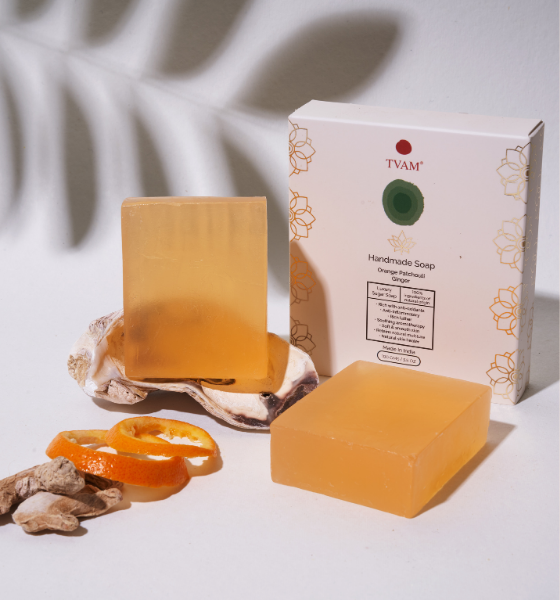
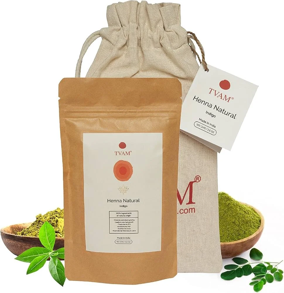
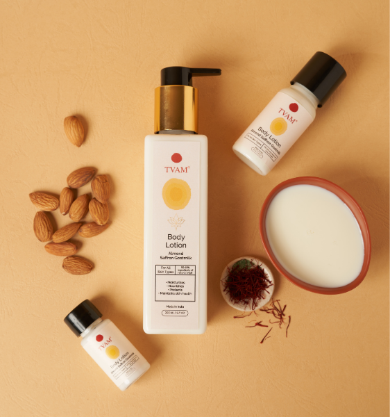
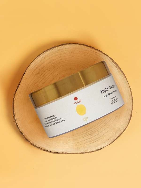
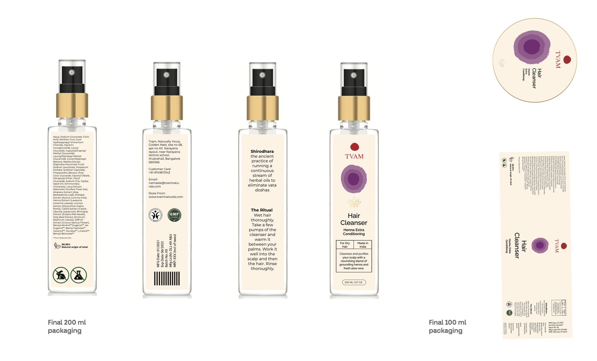
Packaging design for an Ayurvedic brand, Tvam, reimagining its seven chakra-inspired product ranges. The goal was to modernize its appeal for younger audiences while staying true to its roots. I designed minimalist yet traditional labels, creating a sleek, cohesive identity that embodies purity, balance, and holistic wellness.
The old packaging
Tvam’s old packaging felt outdated and muted, failing to capture the brand’s essence or appeal to a wider audience. The seven product ranges, each aligned with a chakra, lacked clear representation. The goal was to create a unified design using a signature symbol on all labels, color-coded to reflect each chakra’s energy.
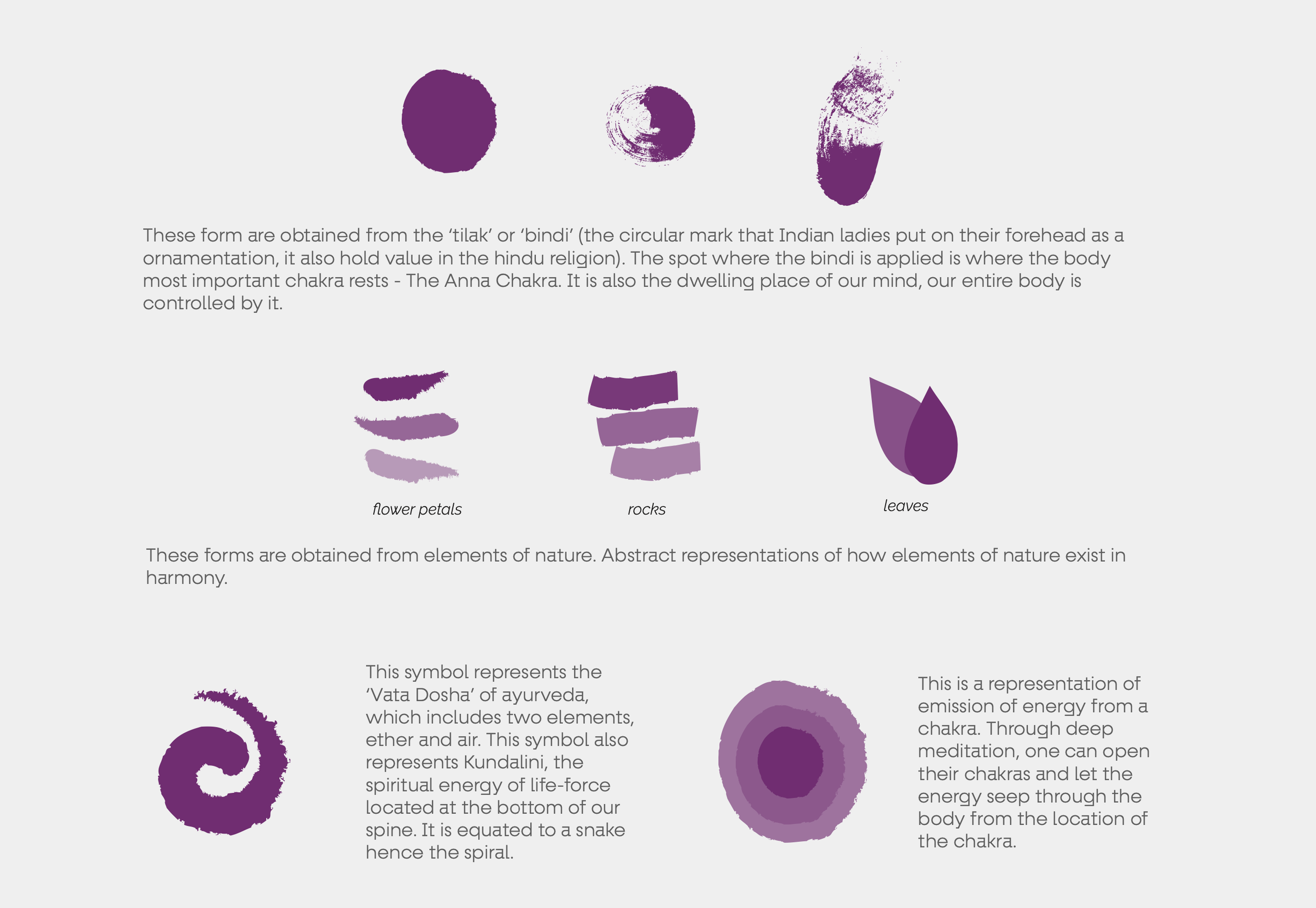
Form Exploration
I started by exploring visual elements that can represent the concept of the brand. We were guided by selected keywords - MODERN TRADITIONAL MINIMAL AYURVEDA .
The Seven Chakras
Once the form was finalized, each chakra’s signature color was carefully defined.
The Golden Lotus
The client wanted a golden element on the label, leading us to choose the lotus. In Hindu mythology, Goddess Lakshmi sits on a lotus, symbolizing purity, wealth, and divinity. Representing the divine feminine, it perfectly embodies Tvam’s essence of nurturing, creativity, and holistic well-being.
